
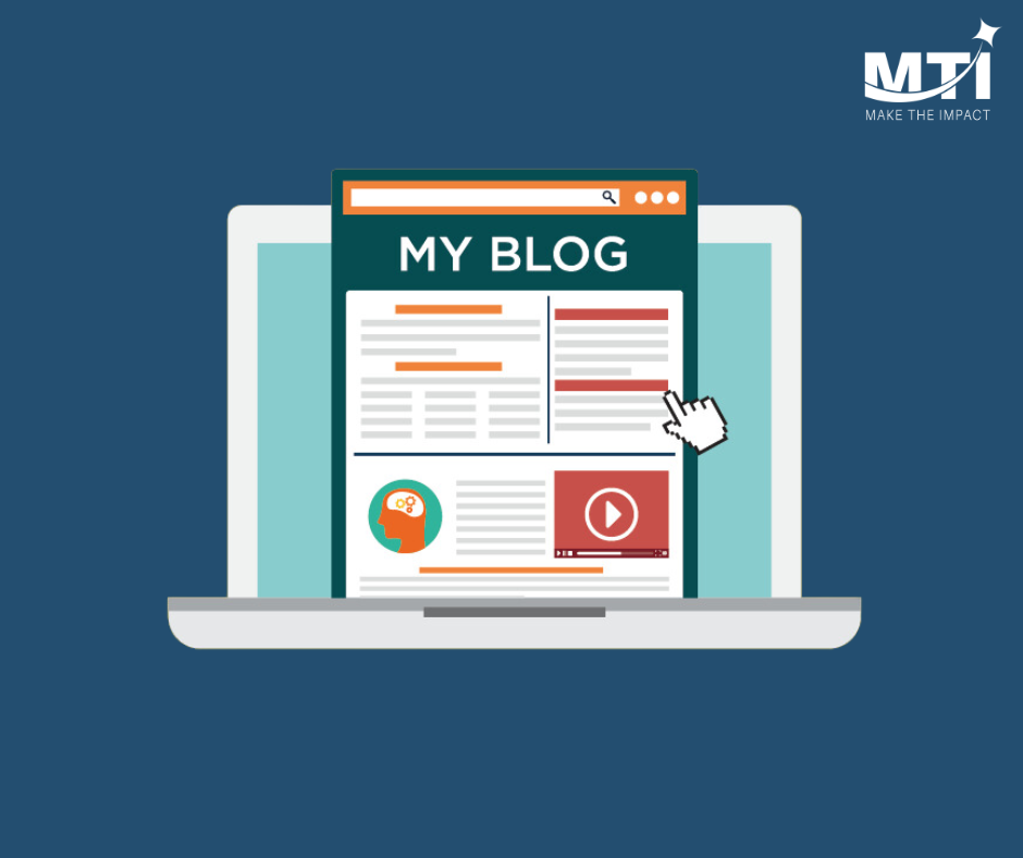
How to Make a User-Friendly Website Optimized for Search Engines
Balance Is Key!
Creating a website that is both user-friendly and optimized for search engines is essential for online success. It doesn't matter what your website is for, balancing usability with SEO (Search Engine Optimization) can significantly impact your site's performance and user satisfaction. In this guide, we'll cover how to optimize your website for different platforms, ensure quick response times, and prioritize essential elements to create an optimal user experience.
Optimized for Different Platforms
Your website needs to be accessible and functional across all devices. This means ensuring that your site looks good and performs well on desktops, mobiles, and tablets.
Desktop
Desktops often offer the most screen real estate, which can tempt designers to load pages with lots of content and features. However, it's crucial to keep your design clean and straightforward to maintain fast load times and ease of navigation.
- Responsive Design: Use flexible layouts and scalable images to ensure your site adjusts correctly to different screen sizes.
- Navigation: Make sure your menu is easy to find and use. Dropdown menus should work smoothly, and all links should be easy to click.
- Content Layout: Avoid clutter. Use whitespace effectively to make your content more readable.
Mobile
With more people browsing the internet on mobile devices, optimizing for mobile is no longer optional.
- Mobile-First Design: Design your site for mobile first and then scale up for larger screens.
- Simplified Navigation: Use a hamburger menu to save space and keep navigation easy.
- Thumb-Friendly Buttons: Ensure buttons and links are large enough to be easily tapped with a thumb.
- Fast Load Times: Mobile users often have slower internet connections. Optimize images and reduce the use of heavy scripts to improve load times.
Tablet
Tablets offer a mix of mobile and desktop features. Your site should seamlessly adjust between both.
- Adaptable Layouts: Use media queries to adjust layouts specifically for tablet dimensions.
- Touch Interactions: Like mobile, ensure that interactive elements are easy to tap.
- Performance: Keep performance in check by optimizing media and scripts as tablets may not handle heavy websites as well as desktops do.
Quick Response Time
A slow website can frustrate users and negatively impact your search engine rankings. Identifying and optimizing elements that slow down your site is crucial.
Identify Items Slowing Down Your Website
Use tools like this FREE SEO Website Report from Make The Impact to analyze your site’s speed and pinpoint what’s causing slowdowns. Some items that may be slowing down your website include:
Ads
- Limit Ads: Too many ads can slow down your site and frustrate users. Use them sparingly and ensure they are not intrusive.
- Asynchronous Loading: Load ads asynchronously to prevent them from blocking other elements of your page.
Host Server
- Choose a Reliable Host: Your web host plays a significant role in your site's speed. Choose a host known for fast, reliable performance.
- Content Delivery Network (CDN): Use a CDN to distribute your content across various servers worldwide, reducing load times for users everywhere.
Widgets
- Minimal Widgets: Only use necessary widgets. Each additional widget can add to your load time.
- Efficient Code: Ensure widgets are coded efficiently and don’t load unnecessary data.
Videos
- Embed Videos: Instead of hosting videos on your server, embed them from platforms like YouTube or Vimeo.
- Lazy Loading: Use lazy loading for videos so they load only when they come into view.
Pictures
- Optimize Images: Use tools to compress images without losing quality. Serve images in next-gen formats like WebP for better performance.
- Responsive Images: Use srcset to serve different image sizes based on the user’s device, saving bandwidth and improving load times.
Size Matters
The physical and visual size of elements on your website can impact usability and accessibility.
Readable Text
- Font Size: Use a minimum font size of 16px for body text to ensure readability across all devices.
- Line Height: Ensure there’s adequate line spacing to make reading easier, typically 1.5 times the font size.
- Contrast: High contrast between text and background improves readability, especially for users with visual impairments.
Touchable Buttons
- Button Size: Make buttons large enough to be easily tapped on all devices. Aim for at least 44x44 pixels.
- Spacing: Ensure there’s enough space between buttons to avoid accidental clicks.
- Feedback: Provide visual feedback (like changing color) when buttons are tapped or clicked.
Pictures
- Relevance: Ensure all images are relevant to your content and add value for the user.
- Alt Text: Use descriptive alt text for all images. This improves accessibility and helps search engines understand the content of your images.
- Loading: Use lazy loading for images to improve initial load times.
Additional Tips for User-Friendly, SEO-Optimized Websites
Clear Navigation
- Consistent Menu: Keep the navigation menu consistent across all pages.
- Breadcrumbs: Use breadcrumbs to help users understand their location within your site.
Clean Design
- Minimalist Approach: Less is more. Avoid clutter and focus on essential elements.
- Whitespace: Use whitespace effectively to separate different sections and improve readability.
Fast Load Times
- Minify Code: Minify HTML, CSS, and JavaScript files to reduce file size.
- Optimize CSS Delivery: Ensure that CSS is loaded quickly to avoid rendering issues.
- Browser Caching: Enable browser caching to store static resources locally, reducing load times on repeat visits.
Mobile Optimization
- Viewport Meta Tag: Ensure your site is responsive by using the viewport meta tag.
- Touch-Friendly Design: Make all elements easy to interact with using touch.
SEO Best Practices
- Keyword Optimization: Use relevant keywords in your content, titles, and meta descriptions.
- Quality Content: Create high-quality, original content that provides value to your users.
- Internal Linking: Use internal links to help users navigate your site and improve SEO.
Creating a user-friendly website that is optimized for search engines is a balancing act, but it’s achievable with the right strategies. By ensuring your site performs well across different platforms, maintaining quick response times, and focusing on the size and functionality of your elements, you can provide a better user experience while improving your SEO.
Curious about how well your website balances user-friendliness with SEO? See how your website stacks up with a FREE SEO Website Report from Make The Impact. Get started today and take the first step towards optimizing your online presence!


